Top 10 Direct Mail Examples
Stuck for inspiration for your next direct mail campaign? We have curated our top 10 favourite direct mail examples that provide a starting point for your next direct mail campaign.
- Chunky Mail
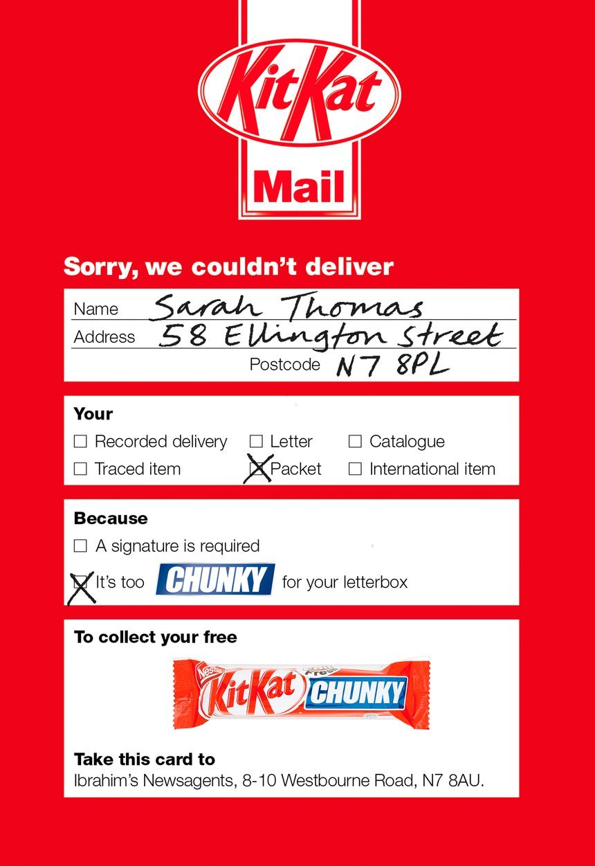
To communicate the chunkiness of Kit Kat Chunky and drive trial, Nestle created a mailer that looked just like the card postal workers leave behind when they’re unable to deliver a package. The real card often states that the package couldn’t be delivered because it was ‘too big for your letterbox’. Nestle’s version of the card claimed that they couldn’t deliver a Kit Kat Chunky because it was too chunky for the recipient’s letterbox. Recipients were directed to collect their free Kit Kat Chunky from their local newsagent.
Image credit: D&AD
- Land Rover
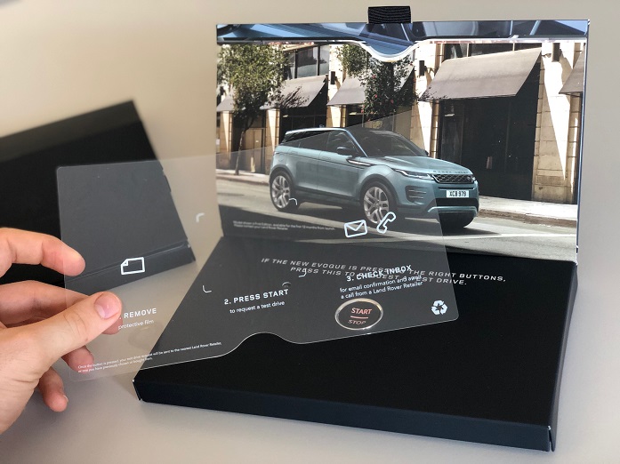
Jaguar Land Rover was on a mission: to get tech-savvy but time-poor people behind the wheel of the new Range Rover Evoque. The challenge was to get them to book a test drive – a pivotal moment in converting drivers into Evoque owners - but these people were bombarded by digital marketing and unlikely to take the time to find out how to book a test drive or contact their nearest Land Rover Retailer. Plus, following GDPR, less than 40% of them were contactable by email.
Jaguar Land Rover created a highly personalised mailing that used a replica of the Evoque's stop-start button that put this highly targeted audience in the driving seat: by simply pushing the pulsating button, drivers could book a test drive in an instant. The button triggered an instant email and text message confirmation. All this happened in real time in a GDPR-compliant manner that required no customer sign-up, pre-interaction or Bluetooth, tethering, or Wi-Fi connection.
Image credit: Royal Mail MarketReach
- Die Cut- Hairdressers
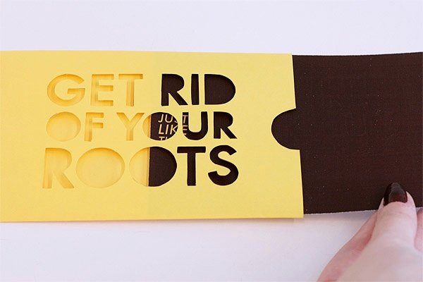
This high-concept promotional piece for a hairdresser by Caroline Henson, 'Get rid of your roots', urges the user to visually 'drain' a yellow design of its darker elements. It's an effective visual representation of dyeing brown roots out of somebody’s blonde hair.
Image credit: Caroline Henson
- BMW
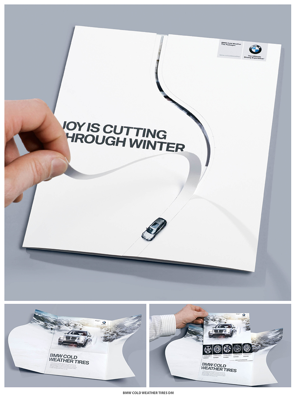
BMW wanted to take a different approach to advertise their winter tyres to Canadians which would really highlight the performance capabilities of the tyres with an interactive mail piece. BMW used a perforated pull tab that mimics a BMW driving effortlessly through the snow.
Image credit: Warren Hardy
- Specsavers
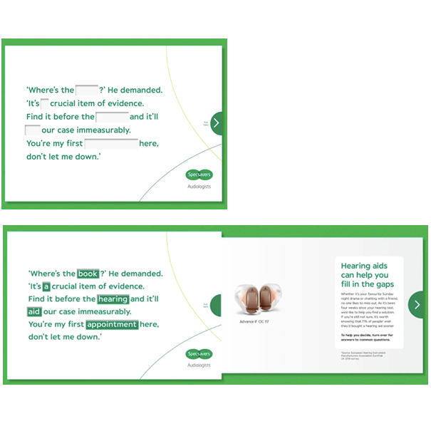
Specsavers wanted to increase numbers of customers coming into store to tackle their hearing. When the recipient pulled the mailing apart, Specsavers filled in the conversation to deliver their message. Clever, right?
Image credit: Royal Mail MarketReach
- Titan Travel
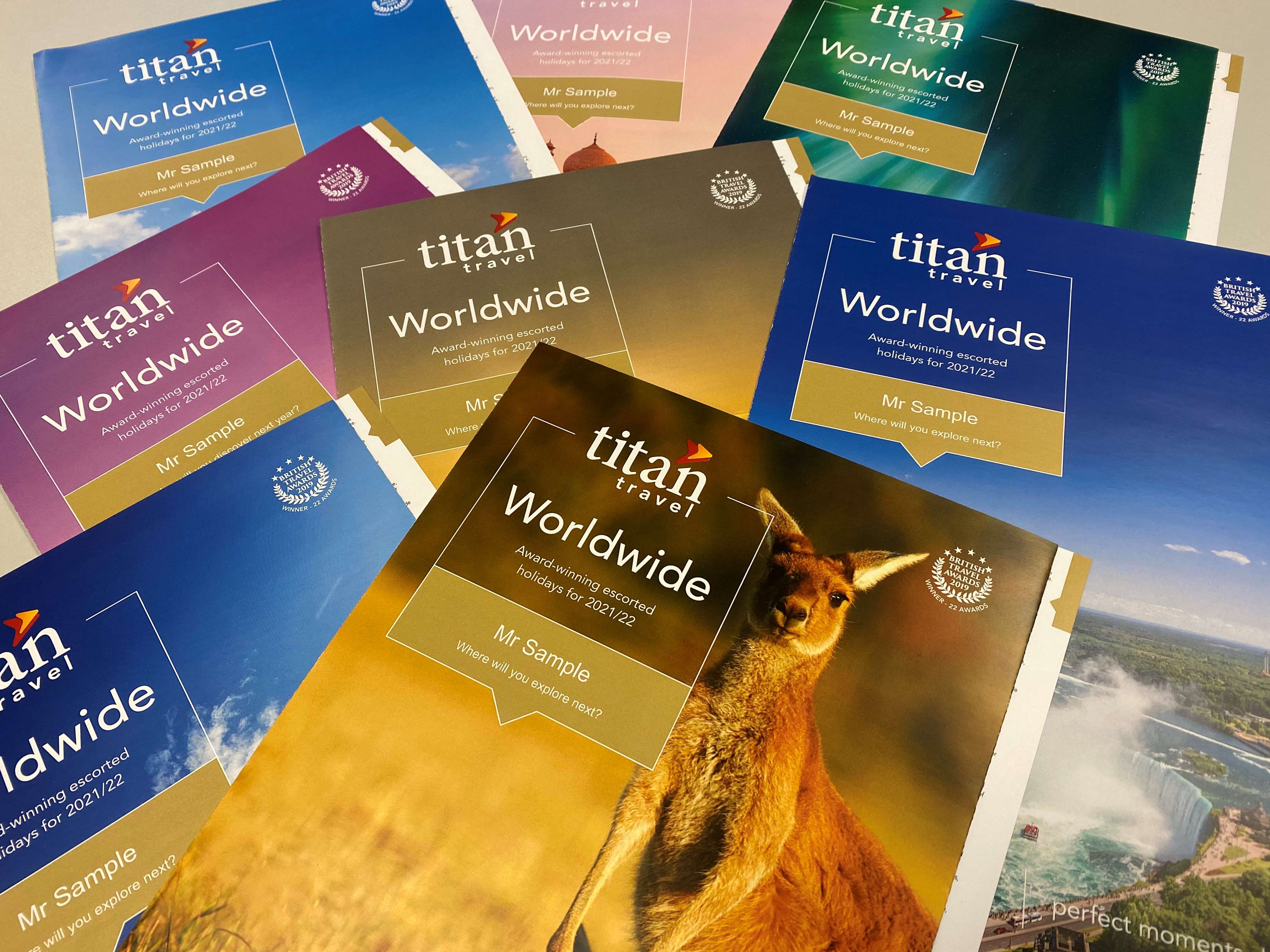
The front cover was selected out of 34 different images to reflect the customers next most likely product to be purchased. The cover featured the customer’s name to provide a more bespoke offering and make each individual feel extra special. Inside it referenced the customer’s last purchase with Titan and the next 3 most likely purchases. The cover also doubled as a throw out for customers to use as a bookmark whilst also providing a more premium feel to the soft touch printed covers. On the back cover, Titan’s contact details were tailored to whether the customer preferred a personal experience with a sales consultant or to book online. There were also multiple versions of base letter text, headers and previous/future holiday suggestions that were incorporated together to create a final text unique to each individual customer.
Image credit: Print Power
- YMCA
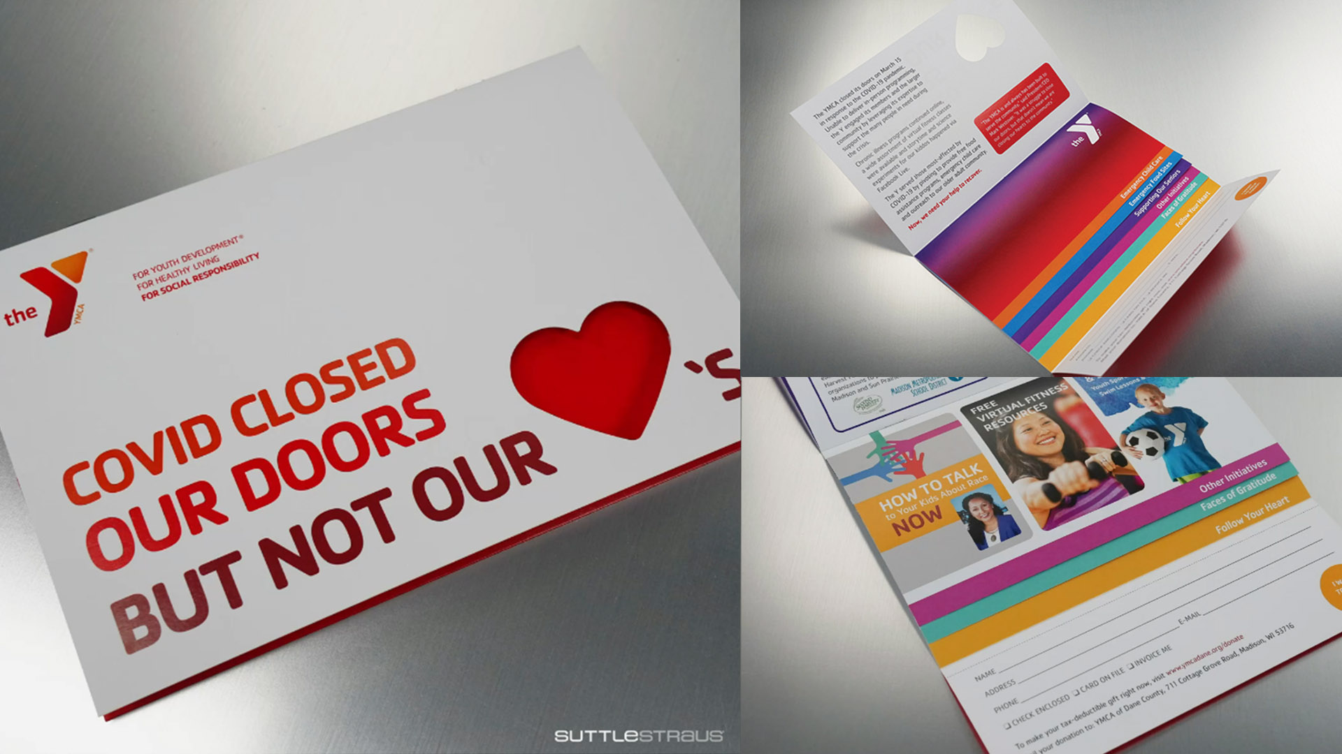 YMCA created a fundraising appeal with a stepped waterfall booklet to explain that even though their doors had been closed due to the Coronavirus, they wanted to showcase the work they continued to do throughout the lockdowns. They also included a donation slip at the bottom of each page.
Image credit: Suttlestraus
- Gothenburg Homeless Aid
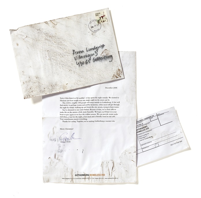
It's hard to get people's attention with charity campaigns and even harder at Christmas. To make the letter stand out in the avalanche of Christmas cards, the agency, before mailing it, let the letter spend a night on the Streets. The letter experienced the same wet and cold as the homeless of Gothenburg- and it looked it.
Image credit: Royal Mail MarketReach
- World Water Day
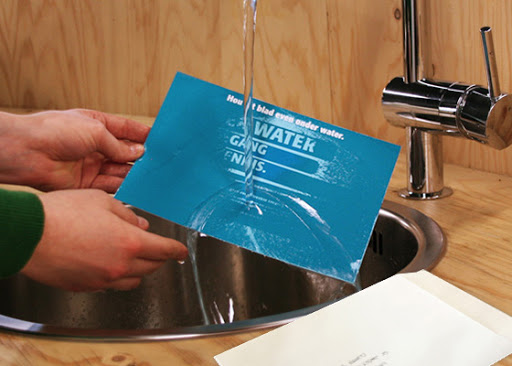
World Water Day sent the mailing to businesses and press across the country with instructions for the recipient to run water over the postcard. Once the card was wet, information about the event became visible- highlighting how most people take having running clean water for granted.
Image credit: Athens Group
- Papa John’s
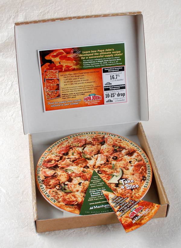
Papa John’s reached out to senior executives with their direct mail and invited them to attend a company-sponsored webinar detailing how the pizza restaurant achieved success. The mailer also contained discount coupons printed on magnetic stock and came in the shape of a pan pizza. To complete their marketing campaign, Papa John’s coupons were packaged inside a pizza box printed with their branding to simulate the experience of receiving pizza from them.
We hope this article has sparked some inspiration for your next direct mail campaign. If you have any ideas you would like to discuss, please email our friendly team at sales@bpdm.uk.
